SOuth Bay
Brewing Company
School Project
Redondo Beach, California
Logo Creation - Branded Content - Merchandise Design - Product Design - Promotional Design - Marketing Strategy
Project Description
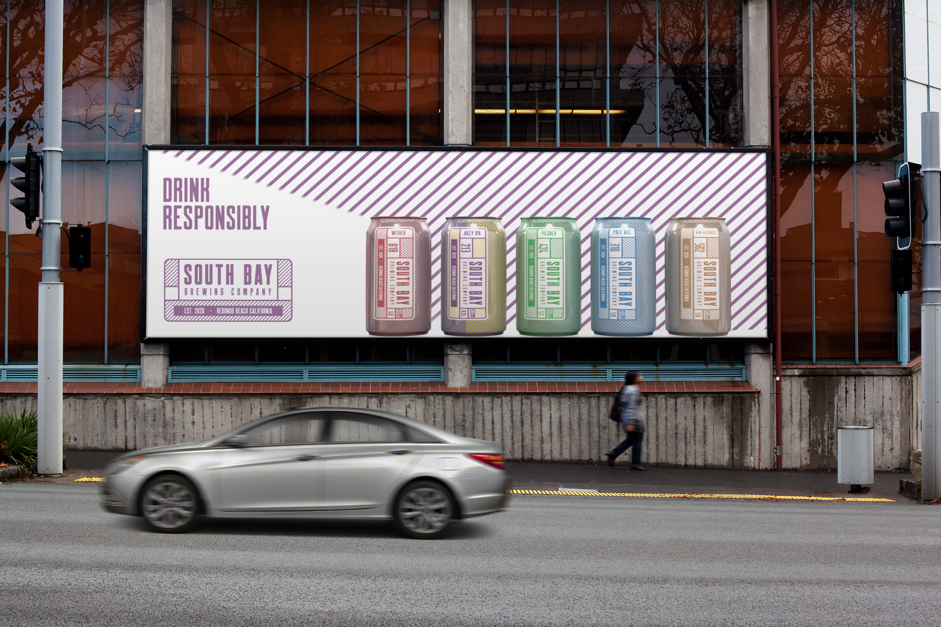
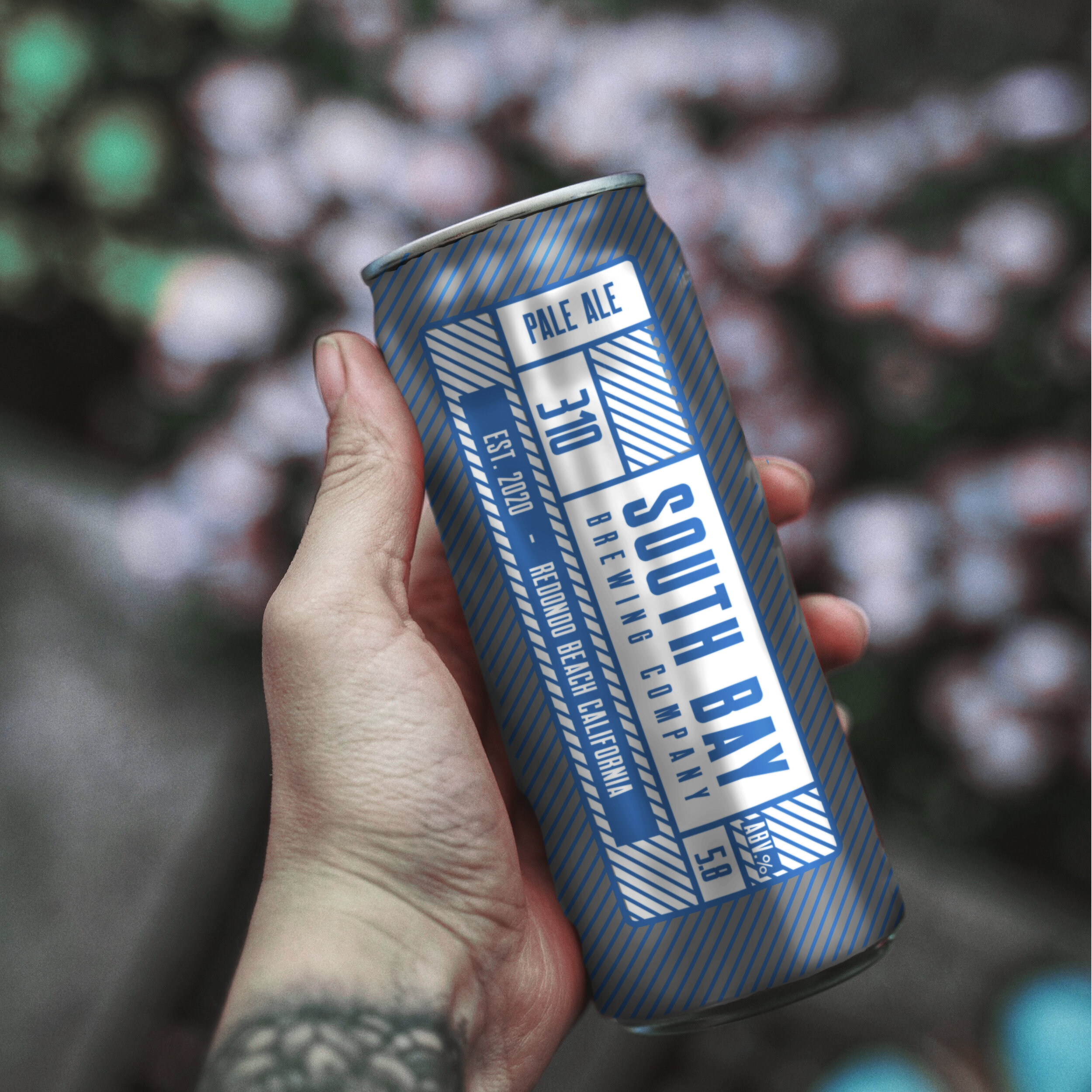
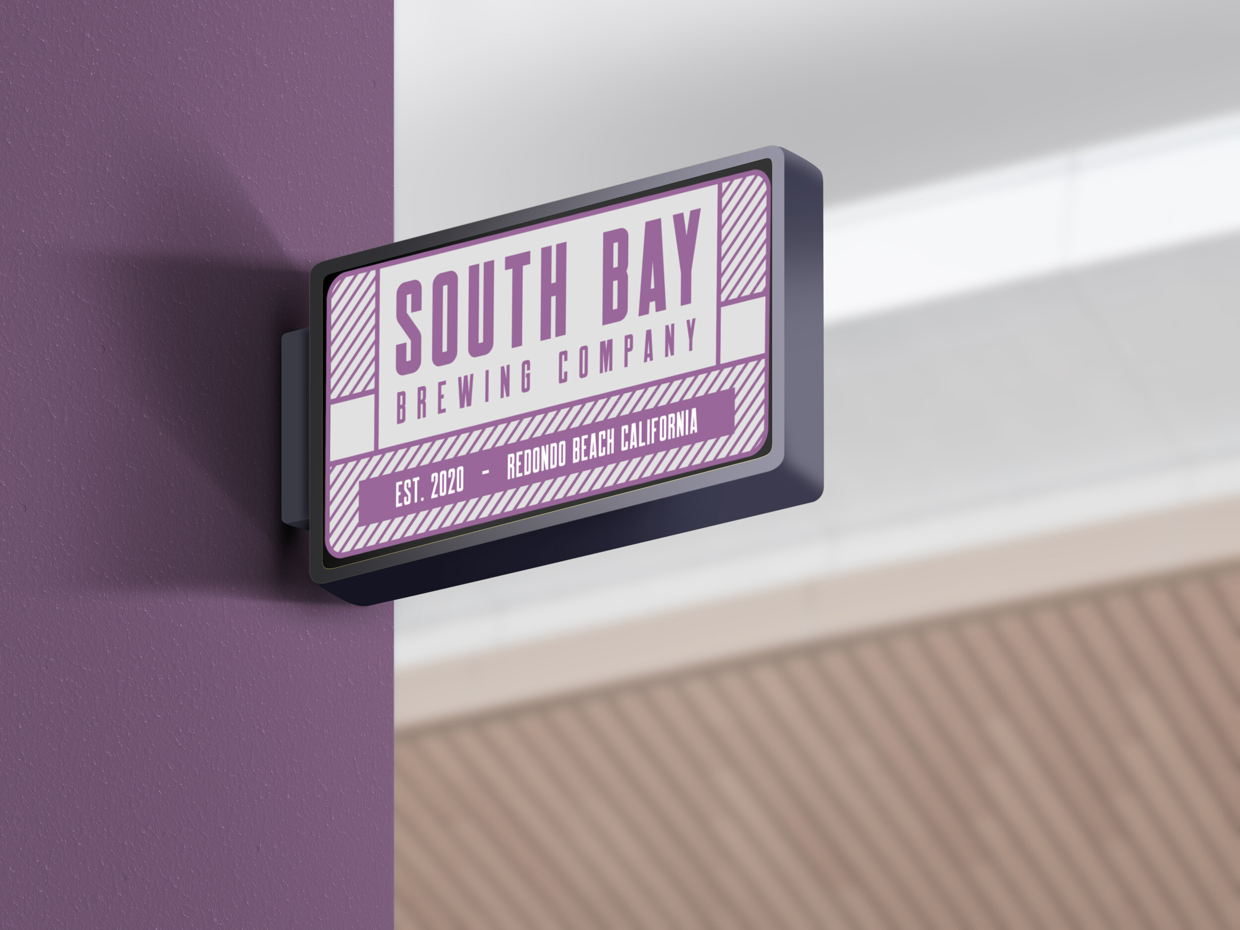
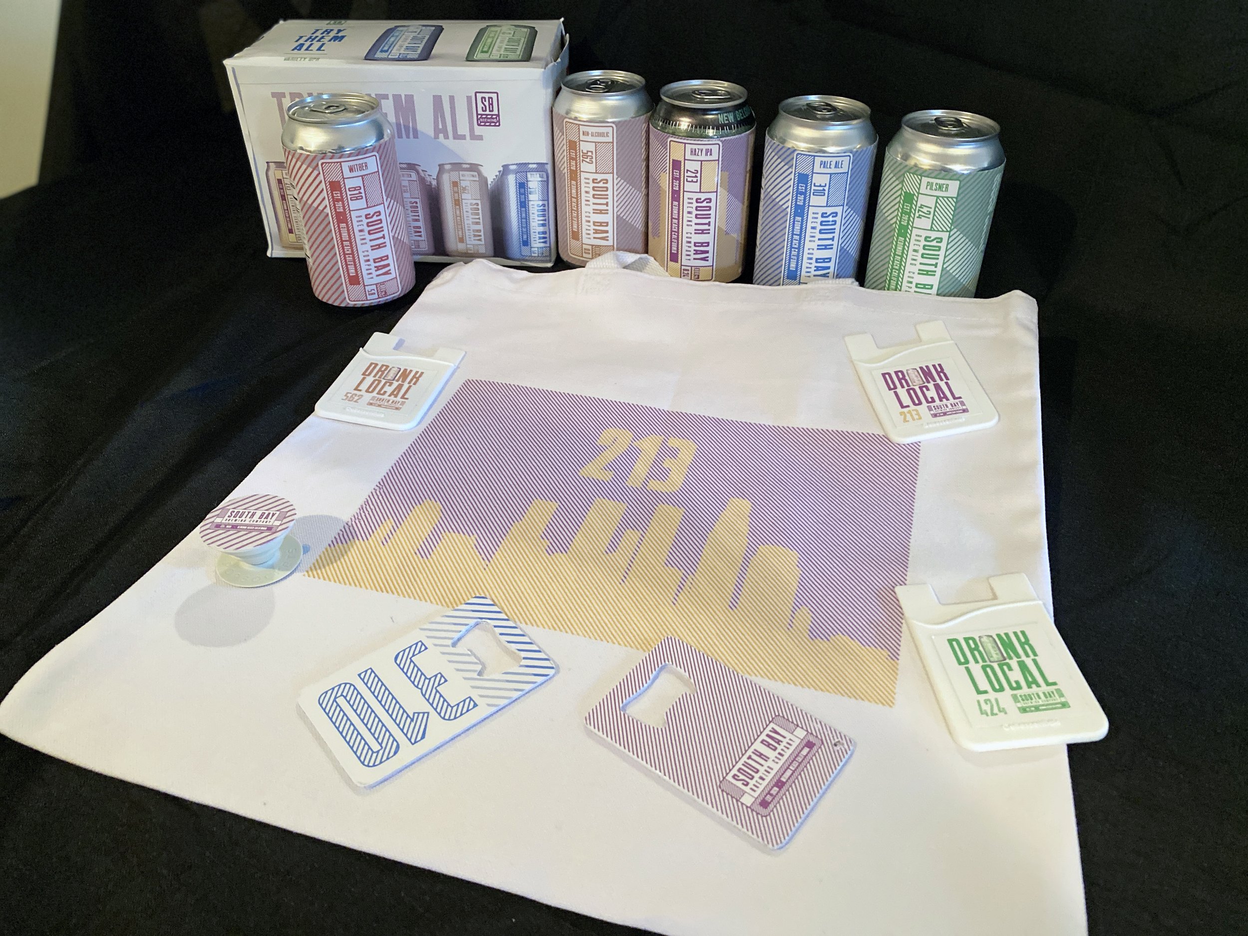
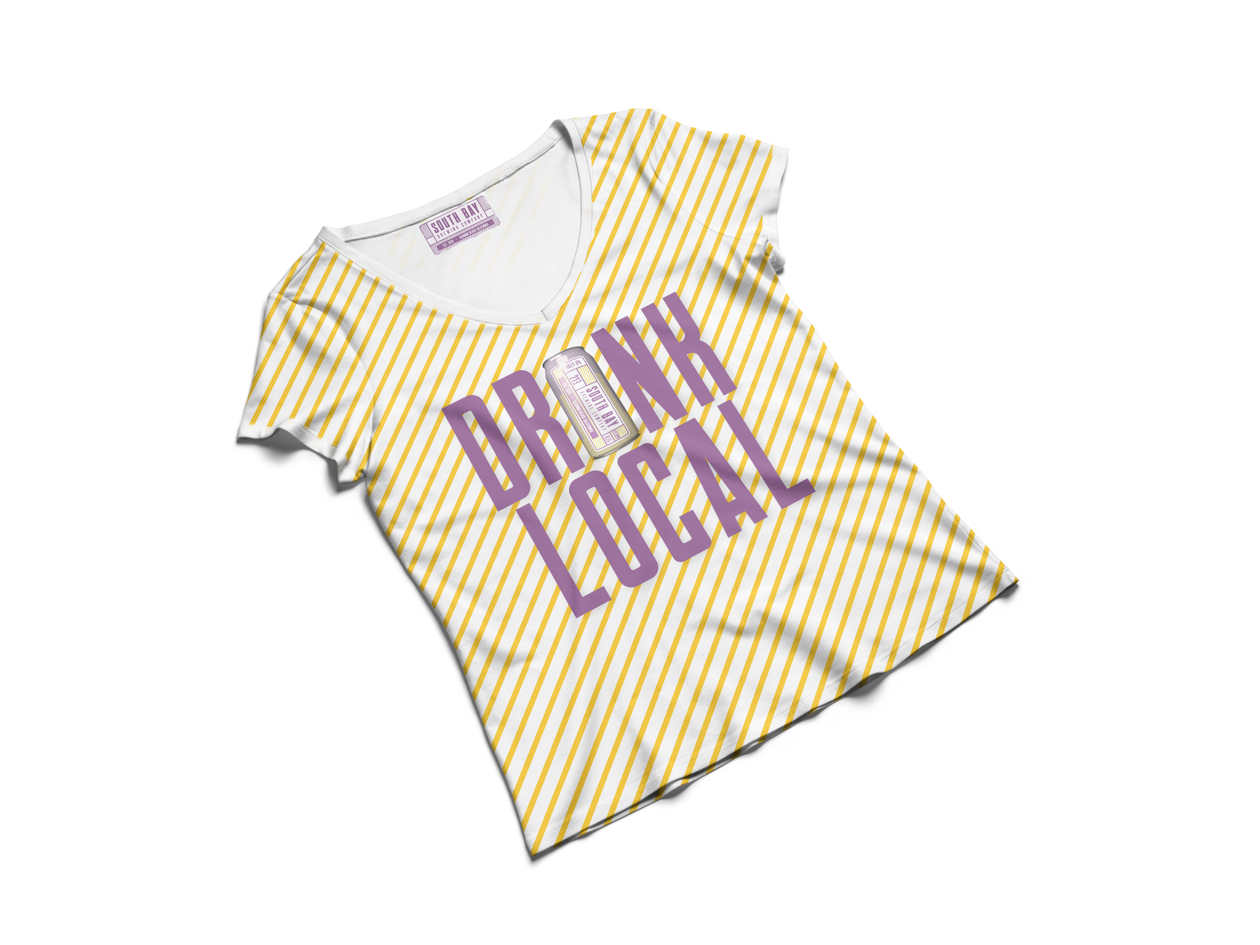
I developed the entire brewery concept, themed around local South Bay area codes. I designed the logo and created a comprehensive marketing campaign, producing content such as billboards, posters, banners, and social media posts. Additionally, I developed a merchandise line and packaging design, all reflecting the brand's local identity. This project showcased my ability to create cohesive branding and marketing strategies from the ground up.

Logo explanation
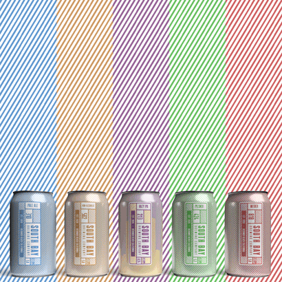
The stripes symbolize community and are essential to South Bay Brewing's brand. While colors may vary, the stripes remain a constant, defining element of the brands identity.
The five sections surrounding the South Bay Brewing logo represent the diverse regions of the South Bay: Beach Cities, Palos Verdes Peninsula, Inland Cities, Los Angeles neighborhoods, and unincorporated areas of L.A. County.
Purple symbolizes creativity and community, countering the masculine vibe typical in breweries, and creating a welcoming environment for all. Rounded corners further soften the design, enhancing the inclusive, gender-neutral appeal of the brewery.